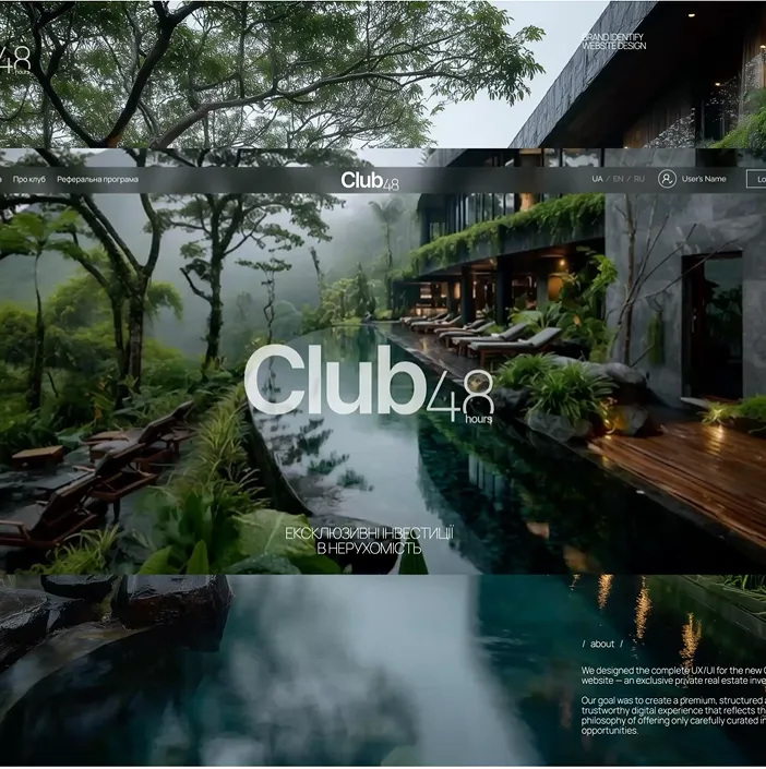
WOW Design vs Conversion: Finding the Balance
Bold visuals attract attention. Clear structure earns trust. The best websites do both — they feel amazing and work effortlessly.
Beauty gets attention. Clarity keeps it.
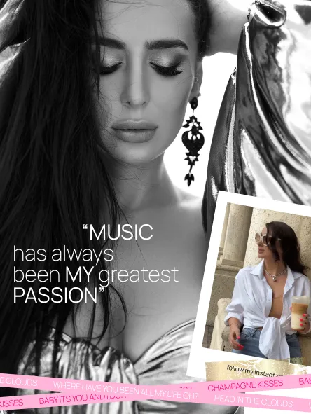
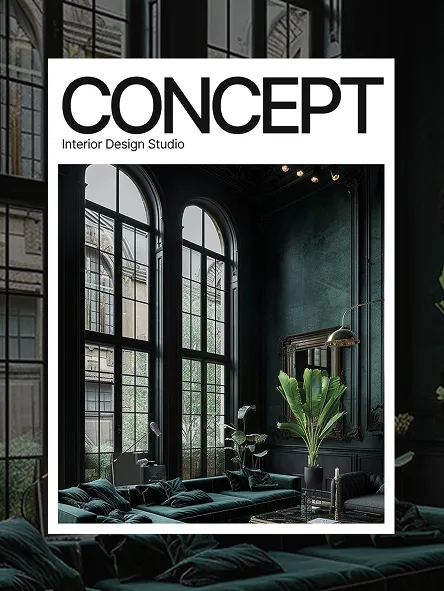
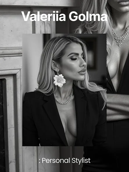
WOW design is what makes people stop scrolling. It sets memory anchors, creates emotion, and sends an instant “this feels premium” signal before a single line is read. It’s the art of surprise, rhythm, and timing — that first second when a user feels something different and wants to stay.
But beauty alone doesn’t convert. The most visually striking websites can still fail if their message isn’t clear, the structure is confusing, or the motion gets in the way of understanding. When creativity turns into chaos, users lose confidence — and the sale, the signup, or the click never happens.
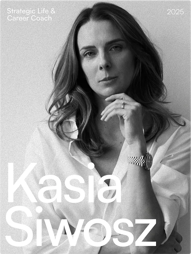
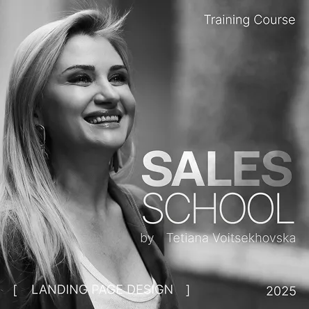
Conversion design is the quiet opposite of WOW. It’s the discipline of focus: one job per screen, one message per moment. It’s about hierarchy — what comes first, what follows, and what never competes for attention. When a page speaks clearly, trust builds naturally. People know where they are and what to do next.
The real challenge is not choosing between beauty and performance, but letting them coexist. WOW and UX are not enemies — they are two halves of one experience. The first attracts, the second convinces. Together they create flow: emotional entry followed by logical progression.
The balance begins with the hero section. One bold visual, one precise sentence, one clear call to action. Each section below should serve a single purpose — explain, prove, or guide. Motion should not distract but direct. Typography should breathe. Whitespace is not emptiness; it’s rhythm and trust. The more room ideas have, the more they feel luxurious and intentional.
Performance is also part of design. Speed is an emotion — a fast site feels confident, while a slow one feels uncertain. Every visual should be optimized, every animation lightweight. Tools like Lottie or CSS transitions create fluidity without compromising performance. When the interface moves with grace and precision, it feels alive — not heavy.
The easiest way to test if your site has balance is to remove the visuals and read it like a story. Does the narrative still work? Does each section answer one clear question — what, why, proof, or how? Does the visitor always have a next step? If the answer is yes, the design will naturally perform.
At The Moss WD Studio, we believe that WOW design and conversion are one discipline. Emotion without clarity is noise; clarity without emotion is invisible. The best websites are both memorable and measurable — beautiful enough to stop the scroll, structured enough to lead the way.
Mini-FAQ
Does focusing on conversion make a site boring?
Only if it’s treated as math. When UX is done right, clarity becomes aesthetic — it feels confident, not dull.
Can minimal websites still have a WOW effect?
Absolutely. Minimalism amplifies emotion when every element is deliberate. Restraint often feels more luxurious than noise.Explore FAQs
